Temperature Change in Connecticut

Global average temperature is a computed value without much direct influence on the local environment. In order to determine its effect on Connecticut, data was obtained from The National Climatic Center and updated to 2014.

The first figure compares the global temperature computed by NASA GISS with the annual temperatures at Bridgeport-Strafford Airport and at Bradley International Airport from 1950 to 2014. It is seen that Bradley (BDL) is increasing at a rate 50% higher than the global rate. The Bridgeport (BGT) location adjoins Long Island Sound and is heavily influenced by the water and averages 2°F warmer than Bradley Airport near the Massachusetts border.   Since 1970, the temperature of Long Island Sound near Millstone in Niantic increased about 2 °F. The temperature increased about 6°F in between the coldest period in the late 1950s and the warmest year in 2012.


annual ct temperature


The climate of Connecticut consists of a growing season and a cold winter period. Therefore the analysis was extended to maximum and minimum temperature that are used to compute the average for each season

ct winter temperature


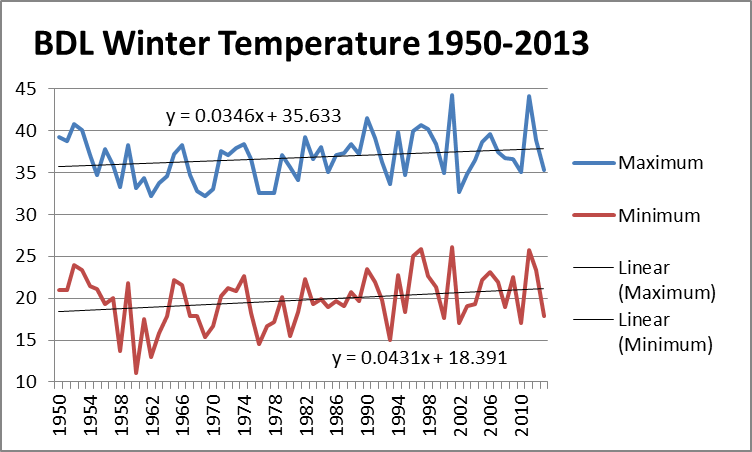
The winter temperatures, particularly the minimum temperatures, increased from the late 1950s increasing 2.25°F during the period. A further analysis showed that the largest temperature increase occurred on the 10% of the coldest days. The minimum temperature in the summer increased at a smaller rate than the winter.

ct summer temperatures

The summer maximum shows no warming since the 1960s. Several times the maximum averages were near 85°F and failed to exceed the value. The year to year variations are much larger than the total change over 65 years.

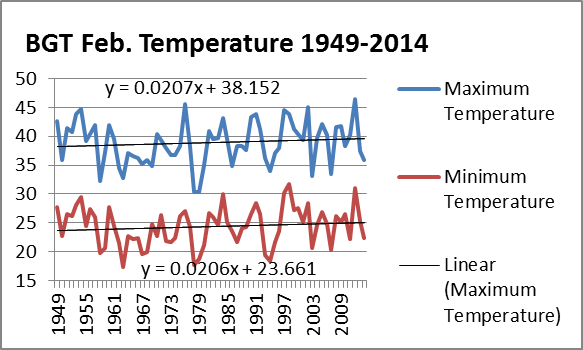
The temperature at Bridgeport for February is shown in the next figure. While trend lines are presented in the graphs, their correlation is very low and is near .01. Thus they have little predictable capability. For example, the record cold of 2015 with temperature of 11.0 and 29.1 were not able to be predicted by the chart.   And if they were included on the chart, the trends would result in cooling trends for Connecticut.


feb ct temperature


Looking in more detail, the following impacts over the past 65 years can be summarized:

  • The year to year variations are larger than the total change in the past 65 years
  • No warming has occurred in the summer in Connecticut since 1960
  • The days greater than 80 F increased about 2-4 days since 1950
  • There were no changes in the number of days exceeding 100 F over the past 50 years at Bradley International.
  • The number of days below 32°F decreased by about 15 in New England.
  • The growing season increased about 15 days. However, two of the 4 latest starts to the growing season occurred in 2002 and 2005 in mid May.


PROBLEMS WITH SEVERE WEATHER


When severe weather occurs, it is often said ‘that you can see the climate changes occurring.’ However, if one looks at the meteorological data, it is difficult to discern any changes in severe or extreme weather. Obviously if there are increases in temperature, there should be an increase in warm days and a decrease in cold days over a long term. And there is some evidence that this occurred over the past 50 years.

The evidence for any changes in severe weather is very difficult to detect. Hurricanes are an example. In the 2000-2005 period there were a number of strong Atlantic Hurricanes and many believed they were the result of the warming. Since 2005, the number of hurricanes were reduced. The longest period in over a century without any category 3 hurricanes hitting the United States is now occurring.   Hurricanes appeared to increase when satellites were first started to be used to detect them in the 1980s as hurricanes that stayed over the oceans often went unreported.

The WMO in 2010 stated that global warming has not resulted in any changes in frequency or intensity of hurricanes. Further the WMO said there is no evidence that precipitation changes occurred in hurricanes. The accumulated cyclonic energy relates to the number of storms and their strength. This is shown in the next figure.   They appear to be cyclic in nature with a decrease since the mid 1990s.

hurricanes

Accumulated cyclonic energy for global hurricanes

The number of reported tornados increased due to better reporting and a greater population. To better understand the variability and trend in tornado frequency in the United States, NOAA examined the total number of EF-1 and stronger, as well as strong to violent tornadoes (EF-3 to EF-5 category on the Enhanced Fujita scale). These tornadoes would have likely been reported even during the decades before Doppler radar use became widespread. The bar charts indicate there has been little trend in the frequency of the stronger tornadoes over the past 55 years. In general, tornadoes are too small to be forecast on global models.

tornadoes


What weather events, if any , can be related to the emission of carbon dioxide or to the recent climate changes. According the IPCC AR5 report in 2014 on extremes

  • There is a lack of evidence on the sign of the trend in magnitude and frequency of floods.
  • There is no evidence of trends in hail and thunderstorms.
  • No evidence of trends or droughts since the middle of the 20th century on a global scale.

The only severe weather that AR5 seem to indicate that increased was extreme heat waves.

Problems with Climate Models

Meteorological models have been increasing in accuracy since they were introduced in the 1940s. Yet it is well know that there are many limitations imposed on the meteorological models so that they are not accurate beyond a few days to two weeks. Theoretical studies using the “Chaos Theory” indicate that accurate modeling beyond two weeks is problematical.   The AGW modelers believe AGW to be a boundary value problem which would remove the limitations.

One primary complaint is the IPCC and most government funding research have gone to complex climate models that are tuned to estimate many conditions across the globe caused by the emissions of carbon dioxide to detect a small temperature change. Small errors can propagate into unknown large ones. There are over 100 of these models written by different teams and their results differ by a range to 3 to 1. And nearly all overestimate warming compared to observed data. What is causing the errors in the climate models that cause them to overestimate global warming? How will any proposed change in CO2 emissions be tested without waiting about 10 to 30 years? The results should give some indication to the accuracy of the models on their 10 to 20 year forecasts and whether their 100 years forecasts will be scientifically defensible.

Problem 1. Failure to match 20th century changes. There is no statistical difference between the rate of warming over the 30 years from 1910-1940 and the 25 years from 1975/1976 to 2000. Climate models fail to simulate the “natural” observed warming between 1910 and 1940. Dr. Judith Curry said Not being able to address the attribution of change in the early 20th century to my mind precludes any highly confident attribution of change in the late 20th century.”

Problem 2. Divergence of model results in 21th century. Statistically significant global warming of the surface stopped 17 years ago and in the troposphere global warming stopped 20 years ago. The models failed to predict any period of 10 years in which the temperature would not rise with increasing carbon dioxide. Overall, the climate models at the turn of the century have forecast temperatures that were higher than the observations for the last 15 years. Over 40 reasons presented for the 17 year “pause” in surface warming indicate that natural climate variability is far greater than climate models simulate, and is capable of overwhelming any climate influence of CO2. Recently, NOAA reanalyzed sea surface temperatures and concluded there is no pause in warming, in conflict with other agencies that compute the global temperature.

Problem 3. Cloud coverage changes. The simulation of clouds in climate models remains challenging. There is very high confidence that uncertainties in cloud processes explain much of the spread in modelled climate sensitivity. However, the simulation of clouds in climate models has recently shown modest improvement relative to earlier models and this has been aided by new evaluation techniques and new observations for clouds. Nevertheless, biases in cloud simulation lead to regional errors on cloud radiative effect of several tens of watts per square meter.   Recent suggestions indicated cosmic rays, may play a part in cloud formation. The IPCC has downplayed these alternatives because they are mainly looking for carbon dioxide as the sole cause of the observed warming.

Problem 4.   Omission of long term oceanic cycles. There are many problems with the climate models and their assumptions. Scientists have shown various long term cycles such as ENSO, North Atlantic Oscillation, (NAO), and Pacific Decadal Oscillation (PDO) influence the global average temperatures, but are not generally a predicted element in the global models.

While the modelers always think their models are representative, they always need to be verified using independent data. Looking at the 10-20 year projections, all the models are much warmer than the current temperatures. All the models assume that clouds will magnify the effects of rising temperatures. (So if we have a cloudy summer, the fall will be warmer!!) The climate projection models presume that as CO2 and the other non-water greenhouse substances increase there will be an increase in temperature. The models do not verify in any way as a good model and fails to be verified according to the Scientific Method.

Problems with Global Temperature

The global average temperature is a calculated number based on stations on land, with some observations over the oceans and each station represents the temperature over wide areas of earth. The calculations of global temperature since 1880 have moved less than the distance on a thermometer that represent 2 degrees F. There are many problems with the calculated global average temperature that need to be considered. Sites with temperature readings will be opened and closed, and sites may be moved.   Missing data are often a problem at the sites. Over time, the surroundings of the site may change and will change the temperature. Changes in instrumentation may result in changes in temperature when accuracy is increased. Some of the remote sites have a large weight in assessing small changes and any inaccuracies at the sites would be magnified.

Problem 1. Site Changes. Known site changes are generally considered in computing long-term averages at a given site. A move to a new location often can be accounted for in the analysis. However, the surroundings at a site that remains stationary may change and be undocumented. Examples of some of the issues include thermometers in parking lots, near building exhausts and developments that change the settings from rural to urban. And these were within the U.S., where the measurements are assumed to be better. These changes certainly compromise the data when dealing with small differences of the temperature being examined over long periods of time. In a study of the climate stations in the U.S., only about 10 per cent of the stations were considered excellent and 70 percent were called highly inaccurate due to siting issues at the stations. The rate of increase at the excellent stations was smaller than the rate observed at the stations with siting issues.

Problem 2. Urbanization. Many of the sites experienced increased urban development near the individual site that gave rise to an ‘urbanization’ effect with an increased temperature over time. This would result in an increased warming trend nearer the end of the period. With the rapidly increasing population and the expansion of the cities, the urban heat island may be affecting more sites. And recent studies have shown increase warming even with the addition of new buildings near the thermometer.

Problem 3. Data Manipulation.   Numerous adjustments have been made in the algorithms to the global average temperatures in the past few years. In some of the computations adjustments are made to “correct” for the changes in the urban heat island effect in the past century. However, anecdotal evidence have been shown over the years that show the earlier parts of the 20th century are cooler now than reported several years earlier, thereby making it appear the warming is more pronounced.

In order to update the GISS global temperature table for the past five years, I downloaded the table recently that gave the data since 1880. The resultant graph showed cooler temperatures than previously reported in the 1940s. So a comparison was made between the 2015 table and the 2010 table. The differences are shown in the figure. All changes toward cooling occur before 1977 with the largest in the 1940s. Considering that the magnitude of the 20th century increase is about 1°C, the adjustments contribute a portion of the increase. It also leads to the question as to whether the global temperature computed from surface stations is a good measure of climate change or whether it just becomes a part of the government side of the global warming controversy.

giss difference

 Problem 4. Seasonal differences.   Several studies have shown that the period October through April are warming faster than the May to September period. Also the polar regions seem to be warming faster than the tropics or mid latitudes. This suggests that the climate is not getting hotter, it has become less cold. This is somewhat contradictory to the direct cause being carbon dioxide in that the downward flux due to carbon dioxide is reduced during higher CO2 when inversion conditions exist. This winter warming seems to be a benefit with a lowering of energy requirements.   And what makes people think the climate around 1900 (or any other year) represents the ideal?


Problem 5. Reason for the Changes.   The main problem is how much of the warming can be attributed to Man’s emission of carbon dioxide in Figure 4. How is the warming of the past 50 years any different from the warming from 1910 to 1940, which the IPCC attributed to ‘natural causes?’ The temperature increase from 1970-2000 was attributed by the IPCC to be the result of the increasing CO2. And why did the warming stop around 2000, even though carbon dioxide continued to increase. And how much of the warming occurs from a ‘reanalysis’ of the temperature in recent years.

It is difficult to determine accuracy of the computed global temperature averages. In general, the temperature has increased over two 20-30 year periods in the last century with minimal changes since 2000. The IPCC attributes the increase in the second period as being caused by the increase in carbon dioxide concentrations.


Basic Global Warming Figure

A number of proxies, including tree rings and ice cores, are used to extend the temperature record to periods prior to direct measurements by thermometers starting in the 1880s. Tree rings from several sites were used by the IPCC (2001) to compute the global average temperature for the past 1000 years. The graphs of temperature showed nearly constant temperature for 1000 years. It was combined with the observed temperature after 1950 and showed the temperature rapidly rising in conjunction with the increased carbon dioxide in the atmosphere that was observed.  This figure became the basis for much of the AGW theories and is shown below.   A popular book “An Inconvenient Truth” written by former Vice President Al Gore in 2006, used the increasing CO2 graph and the temperature graph in his presentations to describe the dangers of the CO2 emissions. The book was made into a movie and Gore won a Movie Academy Oscar (2007). The 2007 Nobel Peace Prize was awarded to the Intergovernmental Panel on Climate Change (IPCC) and Al Gore for their work in promoting awareness of Global Warming. Much was made of the Figure when it was introduced in 2000. And it is the graph that most people associate with Global Warming.

 manngraph

IPCC Temperature Graph 2001

A number of problems arose in conjunction with the graph and the IPCC did not use the figure in later assessment reports in 2007 and 2013.

Problem 1, Statistical and Observational Temperatures. The first was that the temperature representations until 1950 were based on the statistical method results from tree rings and direct observations were added showing a very rapid temperature rise through 2000. Many scientists believe this is akin to comparing apples and oranges.

Problem 2. Historically Not Accurate. The second problem was the change in the climatological history of global temperatures over the past 1000 years. Prior to the invention of the thermometer, it is necessary to estimate temperatures from various sources such as tree rings, ice cores in Greenland and the Antarctic, or historical documents during the past thousand years. It is well known that both colder ice ages and much warmer periods have occurred in the geological life of the earth. There are many theories about the causes of the temperature changes with most focusing on changes in the solar output, or in changes to the earth’s solar orbit. The last ice age peaked about 25,000 years ago and ice covered New England up to a mile thick with a significant lowering of the oceans. Obviously, Man did not end the ice age because he had fires in the caves.

  Lamb temperature

In the past thousand years, the early estimates of the global temperature indicated a Medieval Warm period about 1000 AD when the Viking farmers settled Greenland for 300 years and Vikings landed in Labrador and Newfoundland. Historical records indicate it was a warm period for several hundred years in Europe and in other parts of the world. This was followed by a cold period from 1450 to 1850 that is known as the Little Ice Age. Certainly, there are historical accounts from the colonial period and the American Revolution on the extreme cold of this period. For example, the Connecticut River often froze from October to May in the 18th century. In the first and second IPCC assessment reports, the graph above was presented.  Then it gradually started to warm.

When the IPCC Temperature graph was introduced, the IPCC indicated that the Medieval Warm Period and Little Ice Age were just regional events in Europe and had little impact on the global temperature. Further research has shown that similar temperatures were observed on a world-wide basis. Thus the figure did not reproduce what was known about the temperature changes of the past 1000 years and was not included in future IPCC reports. The IPCC description in 2007 about temperatures in the last 1000 years was:

the warmest period prior to the 20th century very likely occurred between 950 and 1100. The evidence currently available indicates that NH mean temperatures during medieval times (950–1100) were indeed warm in a 2-kyr context and even warmer in relation to the less sparse but still limited evidence of widespread average cool conditions in the 17th century.

Problem 3 Statistical Method. The third major problem with the IPCC Figure was the statistical method used to compute the global temperature using tree ring data. Several statisticians found that the graph could be reproduced with most forms of data including random data points. The graph was not used in later assessment reports by the IPCC.